Xbox on a Smart TV
For this example, we’ll look at the UX challenges that come with setting up cloud gaming on a third-party device.
Xbox console guide
Content designers often need to say a lot with very little. One such example is the button, “Happening now,” which appears when a player navigates to the People tab in the guide. Pressing the button shows you a list of joinable friends that are actively in a party or game chat or have a multiplayer game about to start via the Looking for Group feature. The challenge of this string wasn’t just distilling all these scenarios into something short and sweet to avoid truncation. (German text localizes crazy long, y’all.) The string also needed to reflect a sense of immediacy to entice online enthusiasts.
Xbox Accessories app
This an example of making better use of screen real estate to inform players in the moment. The original configuration screen in the accessories app had almost a third of unused space on the right side of the screen, so we got the okay to use the space for descriptive text. Now when a player moves their cursor over a setting, feature, or action, the text on the right shows some info in the context of what’s highlighted. We can’t assume everyone knows what this stuff is, so it makes for a nice little teaching moment—and if we can save someone the trouble of having to Google it later, even better.
Accessibility hub - main page
Accessibility hub - category page
Accessibility Hub
We redesigned the hub experience on xbox.com to make accessibility support easier to use. This was achieved by taking a more deliberate, hand-holding approach. When a player lands on the redesigned page, they simply need to choose the tile that best represents their need—visual, aural, input, etc. Clicking on a tile sends them to a category page containing links to every relevant accessibility article for Xbox and PC. Data informed our hierarchy while user research (UR) helped up us round out the rough edges. For instance, testers found the original number of tiles on the hub page to be overwhelming, so we reduced the total number to six. On the category pages, we added brief descriptive text for each section as a breadcrumb for people with little-to-no knowledge of the subject matter. This makes it easier for players to find the right help the first time.
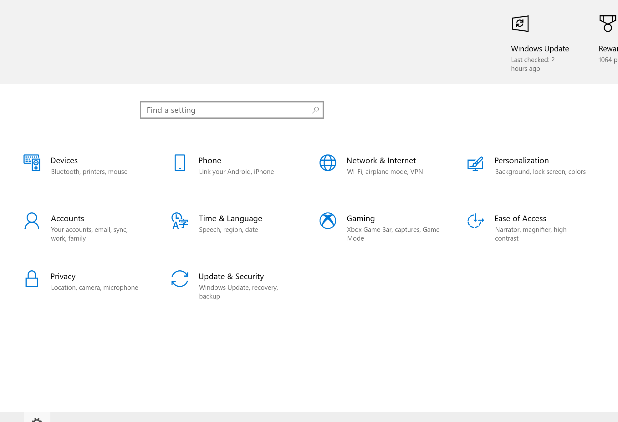
Windows Settings
Categories can be tricky because people have differing opinions about where settings belong. With that in mind, we were afforded a little bit of space for helper text below the category headers. Our breadcrumbs needed to be succinct for scanability and user telemetry played a role in determining what settings to include. As for the search box text, we could’ve shipped a string like, “Search for a setting,” but I like promoting positive outcomes when it’s contextually appropriate. In this case, “Find a setting” sets a more confident tone.


